Pharma Store Inventory Management Web Application
About This Project
This project involves revamping a web application for a client with multiple pharmaceutical stores in India.
The goal is to create a user-friendly platform with improved navigation and seamless prescription handling, providing a better experience for customers and improving operations for the client. The project also includes redesigning the current inventory management system and adding an admin panel to manage the entire process in one place.
ROLE
Visual Design
Prototyping
Client
Pharma Stores in India
Date
2022
Tools

The Problem
The current web application suffers from an outdated and cluttered design, filled with unnecessary elements that hinder usability. This impacts both customer experience and operational efficiency, making it challenging for users to navigate and access essential features seamlessly.
Challenges
One major challenge was the language barrier, as the client had limited English proficiency, and I do not speak Hindi. Effective communication relied on translations provided by my supervisor and team, ensuring all requirements and feedback were accurately understood and addressed.
Project Goal
The goal of this project is to redesign the web application for a client with multiple pharmaceutical stores in India. The focus is on creating a user-friendly platform that improves navigation, simplifies prescription handling, and streamlines operations. The project also includes revamping the inventory management system and adding an admin panel for centralized control.
Solution
To address the challenges, I redesigned the web application with a focus on simplicity and user experience. I improved navigation, simplified prescription handling, and streamlined operations. The inventory management system was revamped, and an admin panel was added to provide centralized control. These changes ensure a more efficient and user-friendly platform for both customers and store managers.
User Research
I met with stakeholders to identify issues in the existing system and determine necessary improvements.
Through team meetings, I also conducted user research, engaging with clients to understand their pain points and goals, which helped tailor the design to their needs.
Research Findings And Insights
Cluttered Interface
The interface overwhelming, with many elements on the screen, making navigation difficult
Lack of Centralized Control
The lack of a central admin panel made it hard for store managers to effectively oversee and control the system
Outdated Design
Design was old-fashioned, making the platform difficult to navigate and less engaging for users
Complex User Experience
Focus on enhancing usability, streamlining processes, and offering centralized control for better management
Review Sections
We followed the Agile methodology, where I completed one feature at a time. After finishing each feature, I discussed it with stakeholders, and my supervisor reviewed the design every two days.
Implementation
I closely collaborated with the team throughout the project, working directly with one front-end developer and two back-end developers to ensure alignment and smooth progress.
Design System
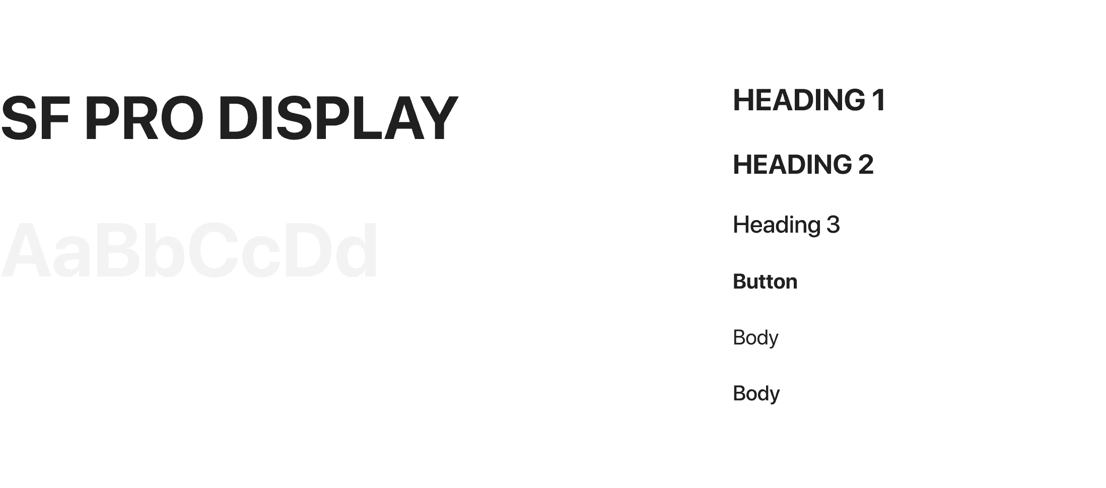
Typography
993D3F
FD6466
2C2731
7E84A3
Navigation
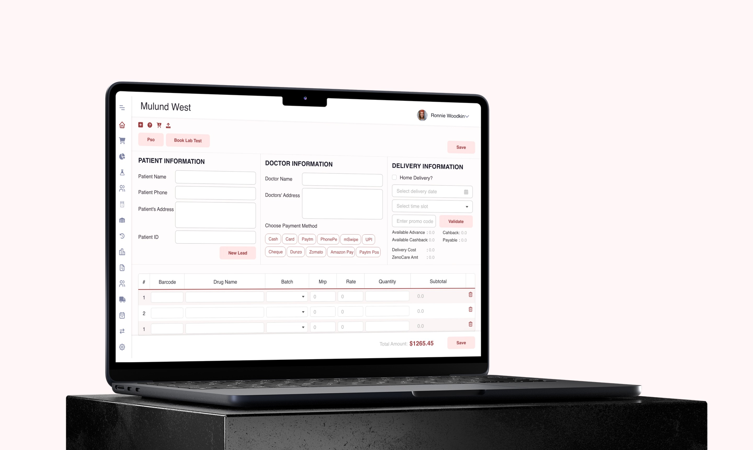
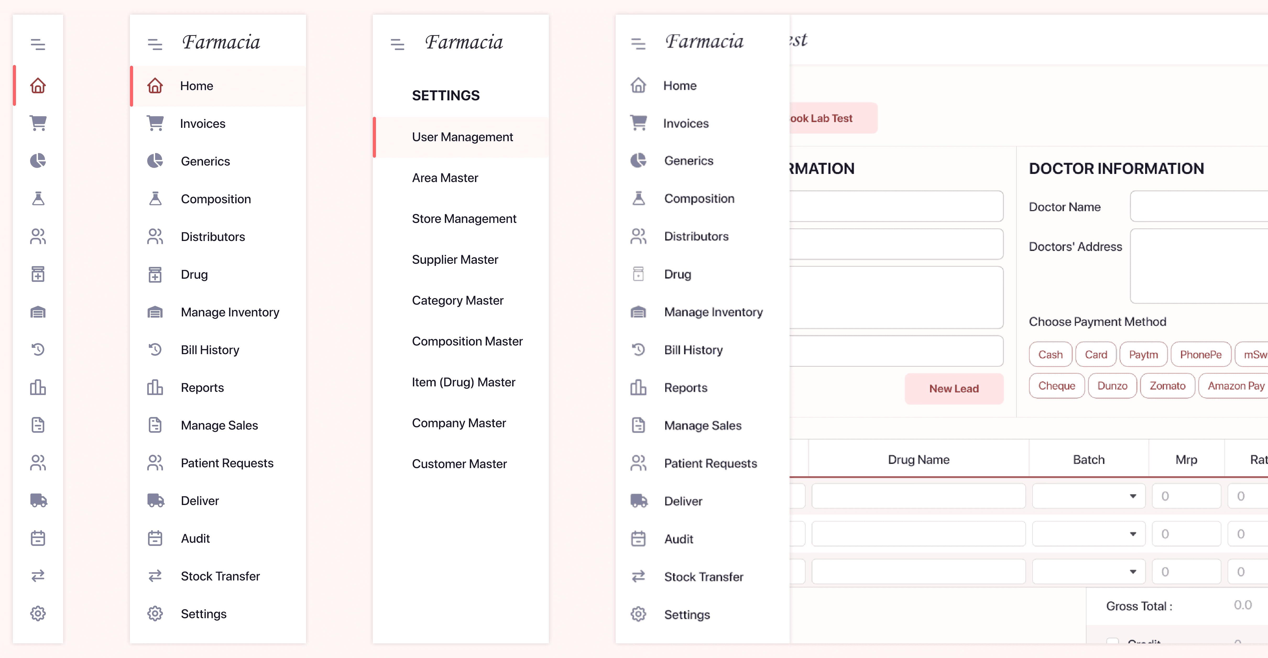
I changed the navigation from a top bar to a sidebar, removed unnecessary items, and added clear icons to make it easier to use.

UI Design
UI design focuses on creating visually appealing and user-friendly interfaces using Adobe XD, ensuring easy navigation and an engaging experience while aligning with the brand’s identity.
Newly Added Admin Panel
I added an admin panel to provide centralized control, making it easier for managers to oversee and manage operations efficiently.


Design Updates
After gathering essential insights through discovery work, I moved on to enhancing the interface. The process began with a font audit, layout, and grid updates, followed by spacing adjustments and adding visuals to improve aesthetics.
Some key updates included:
Introducing a fresh color palette for a cohesive and modern look.
Updating the navigation bar for better usability.
Designing new filters for quick and efficient content browsing.
Refining spacing and alignment to create a cleaner, more balanced layout.
These updates ensure a visually appealing, user-friendly interface while maintaining functionality.

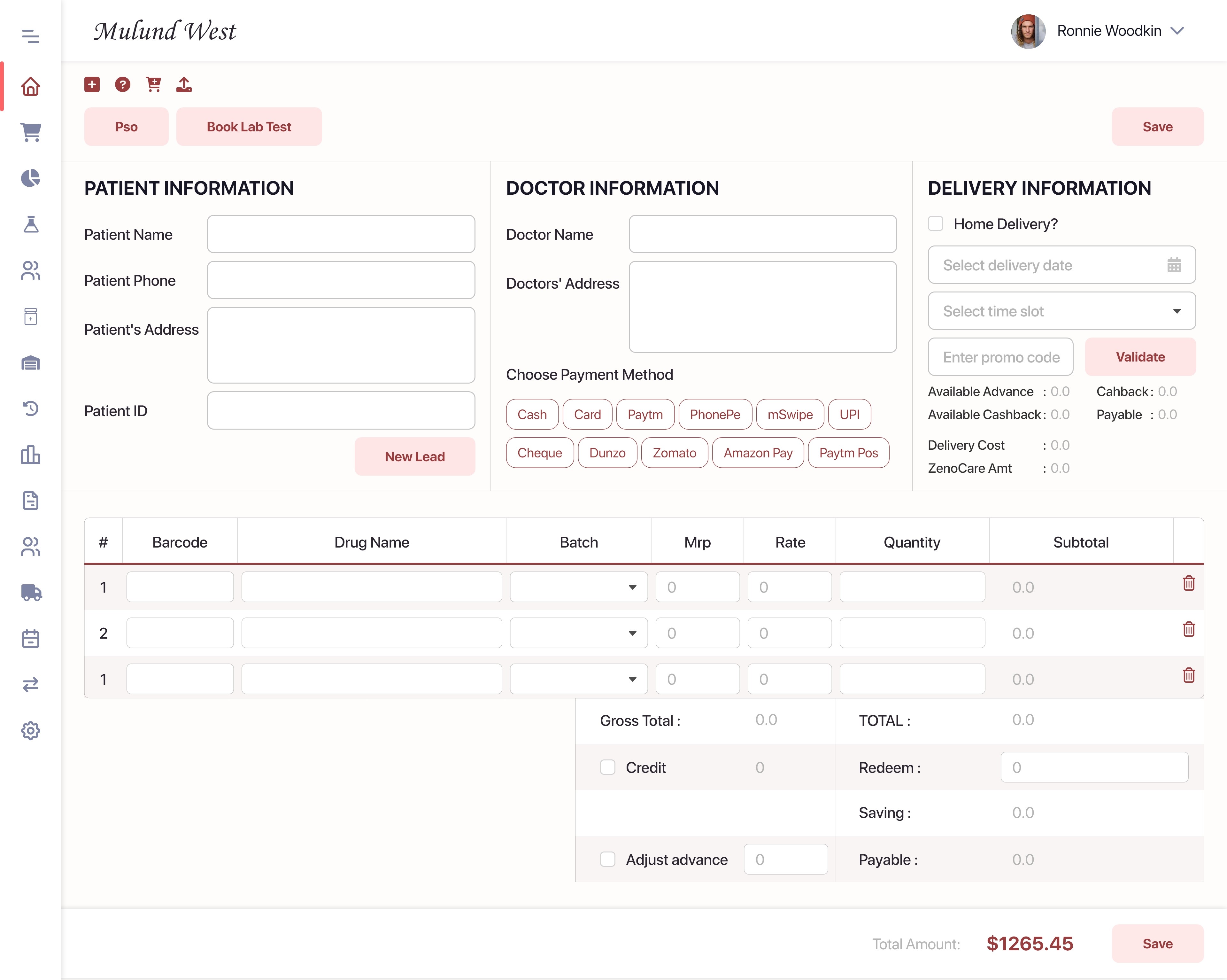
Hi-Fidelity Prototype
Summary
The redesigned web application improved usability, visuals, and functionality with updates to fonts, layouts, colors, and navigation. New filters and better spacing enhanced the overall user experience.